Our Brand
Canadian • Service Through Motion
"Canadian - Service Through Motion" captures the essence of our identity in four powerful words. It is not a slogan or a tagline; it is our anchor. It defines who we are and how we operate, every day, across every region we serve.
Canadian
This signifies our strength, trustworthiness, and sense of duty drawn from the vastness of our nation. We are proudly Canadian, grounded in the values and resilience of the True North. From coast to coast to coast, we forge connections across our country and far beyond. The words "true north strong and free" from our national anthem are more than lyrics to us. They inspired our brand, our purpose, and our identity.
Service
This is the core of our business; the reason we exist. It reflects discipline, dependability, and an unwavering public commitment. We are built to deliver, whether conducting critical essential service or emergency response missions, ACMI flying on behalf of our airline partners, flying Ad-Hoc charters or dedicated charter work across communities and industries. Service for us is not just about getting the job done; it is about doing it precisely, reliably, and with care.
Through Motion
This highlights how we serve; through movement. Flying is our medium, which we define simply as being in motion, by having momentum. We deliver impact through flight by moving people, goods, and resources. Through motion, we create momentum, for communities, for clients, for Canada.
Brand Transformation: A New Chapter
We stand at the beginning of a new chapter. With new ownership, expanded leadership, and a new mandate, Great North represents our biggest pivot yet and our boldest move forward. This is not a name change. It is a full realignment with higher ambition, a clear focus, with inspired national pride at the centre.
The name Great North was chosen deliberately. It reflects the strength, scale, and identity of the country we serve. It ties us to the vast landscapes of Canada, from its largest urban centres to its most remote regions. It speaks to the resilience and ambition of those who live and work across this nation.
With new aircraft, new partners, and experienced leaders joining our team, we are entering this next phase with energy and clarity. Our operations are growing. Our reach is expanding. Our vision is now firmly set on being Canada's aviation partner, trusted for safety, known for excellence, and respected for how we honour community, culture, and service.
One Brand, Full-Service Aviation
Great North Airlines delivers comprehensive aviation services under one unified identity—from mission-critical B2B operations to customer-facing charter services.
B2B Operations
Essential services and emergency response, ACMI operations for airline partners, and dedicated programmes for government, NGOs, institutional, and industry clients. We operate with professionalism, precision, and discretion—whether putting our client's brand forward or operating with complete privacy.
Charter Services
Great North Airlines is the name customers see when booking a charter—through our partnership with Air Charter Service, directly with us, or through other broker networks. We deliver a proudly Canadian airline experience, grounded in professional rigour and delivered with hospitality and care.
Our Brand Identity
Symbols of Strength and Purpose
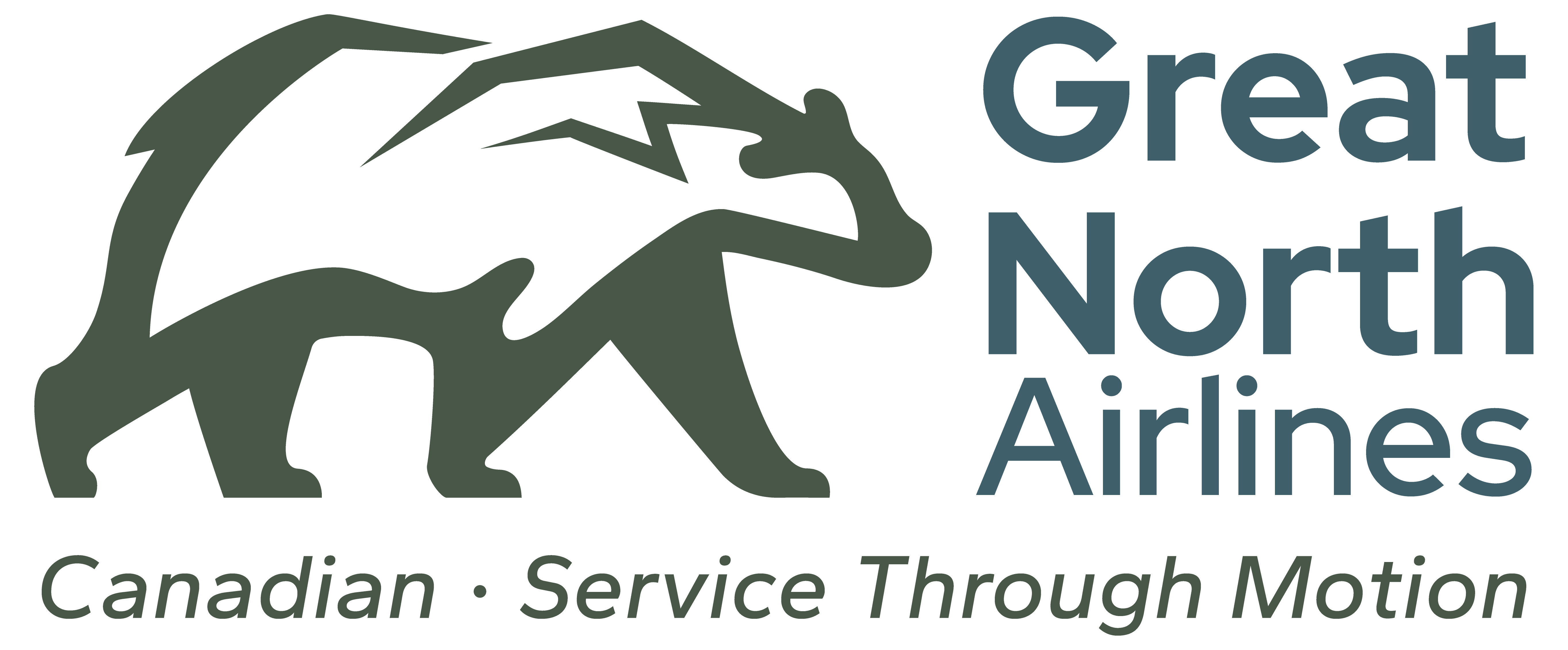
The Great North Bear
At the heart of our visual identity is the Great North Bear, a symbol of strength, purpose, and protection. Our bear is calm but forward moving. It was designed to convey confidence without aggression, resolve without rigidity.
A symbol of national strength and protective resolve, the bear represents our commitment to being a trusted partner. In Indigenous culture, the bear is seen as a guardian and protector. Inside the bear, a mountain peak echoes Canada's terrain, a tribute to the land we serve and a reference to "true north strong and free."
Forest Green
Our foundation. It represents the southern forests, rural communities, and grounded character of our home base in Southern Ontario. It is natural, stable, and enduring.
Northern Steel
Our contrast. A grey-blue inspired by the Arctic and high North. It speaks to resilience, and to the seriousness and respect we carry in service to the northernmost parts of Canada.
Our Typography
Our typeface is modern and clean. It is deliberately no-nonsense. Bold. Readable. Professional. Like our operations, there is no pomp nor circumstance here. Every detail is deliberate. Every element is purposeful. We are built for clarity, and our typography reflects that.
Moving Forward as One Great North
The unveiling of Great North is the beginning of a new journey that we all share. As we embrace this identity, we also embrace the cultural transformation that comes with it.
Our brand is built on trust, dependability, and service - qualities that must shine through in our everyday actions. We hold ourselves to the standards represented by the bear: strong and protective.
Canadian • Service Through Motion
We are Great North, inspired by our nation's anthem, True North strong and free. We live this in our resolve, and our journey, in motion and united.